
Raw vs. Designed Pins: Why Your Current Approach to Pin Design Might Be Wrong
Raw vs. Designed Pins: What Pinterest’s Viral Data Means for Creative Brands
Pinterest is a place for pretty pictures, and that’s not just a subjective view of the platform but rather an objective fact, cited by Pinterest itself. As an image-based site, a creative business owner looking to use it to market their products has likely struggled with this question:
“Are my photos even good enough for Pinterest?”
It’s a common worry, and you’re not alone. The pressure for Pinterest-perfection seems intuitive, especially for makers who have the most brutal internal monologue. Trust me, I’ve been there.
But here’s the truth, straight from the most recent Tailwind study on Pinterest virality: it’s not about perfection. It’s about clarity, context, and connection. As a Pinterest manager, I can validate this from the number of times I’ve encountered the ugliest Pins achieve super success on the platform. Let’s unpack what the data actually reveals, and how to use it to your advantage.
Raw Photos vs. Designed Pins: The 50/50 Split That Changes Everything
I will be the first to admit that I get a little carried away with my Pin designs. Canva is my creative space when I’m putting in a ton of hours with client work and can’t get to my bench.
But, in light of the Tailwind Viral Pin study, I’m beginning to accept that I’m not designing Pins for me but for users on the platform.
Let's break it down.
Tailwind mapped both raw and designed Pins across 20 categories of various interests, such as art and fashion, to identify which Pin aesthetic the most viral Pins represented in each category. The findings revealed that specific categories favored more raw images, while others preferred more designed Pins. Overall, the mix differed dramatically across all categories.
Here’s the mapping they saw of the top categories among the most viral Pins:
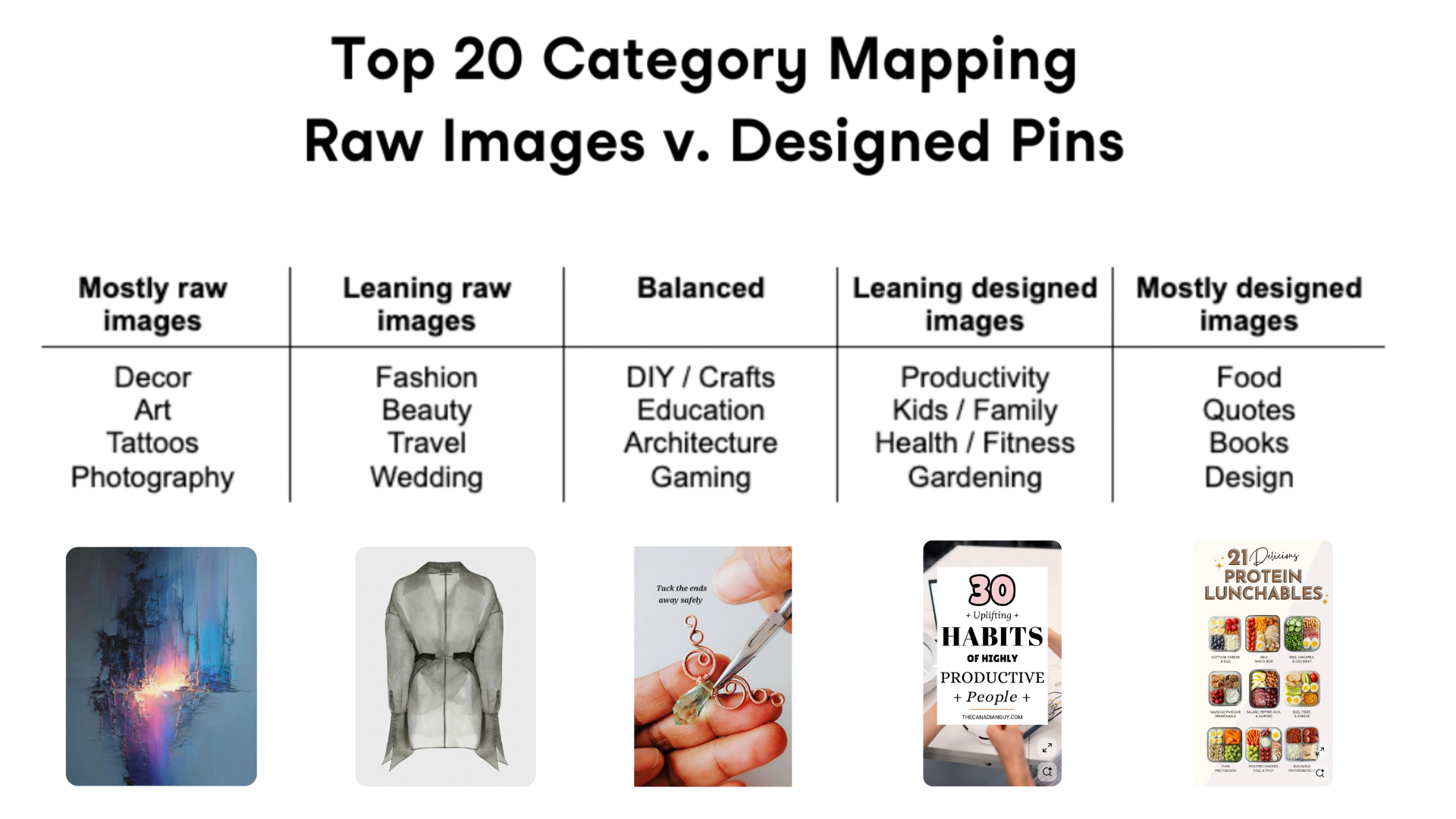
It’s reasonably straightforward why these categories have their own propensity towards either raw or designed elements. If you’re an artist, your art speaks for itself; however, if you're a productivity blogger, your Pins need more contextual information. Adding this extra layer of context requires design tools.
To better understand the virality of designed Pins, Tailwind analyzed Pins created with various tools, including professional-grade tools like Photoshop, accessible tools like Canva, and non-design tools like PowerPoint.
The point is that 60% of viral Pins were not created with professional or accessible tools.
Tailwind cited:
“We saw a lot of over-customization in Canva-style images. Too many colors, too many fonts, too many images crammed into a design, too many effects. Freedom to do more is nice, but it also tempts us to do too much.”
And, get this, there was also not a single designed Pin image amongst the most viral Pins that appeared to require a professional tool, such as Photoshop, to create.
Tailwind thinks the reason for this is the time it takes to create a designed Pin with accessible tools like Canva. When polling users, they claim it takes 15-45 minutes to make one Pin image in Canva. This would be a reasonable conclusion.
Another less talked-about reason is the promoted Pin density on every surface and in every feed. The ad load ranges from 43% to 56% of Pins shown in search 😵💫. As a user, this experience can be frustrating and may turn them off to any Pins that appear to be ads.
In other words, users train themselves to ignore promoted Pins or Pins that look like them. Overly designed Pins share many of the same characteristics as ads, such as text overlay and super-polished images.
The good news? Less is definitely more.
This should inspire you to streamline your Pin design so you can stay more consistent with pinning, increasing your chances of going viral.
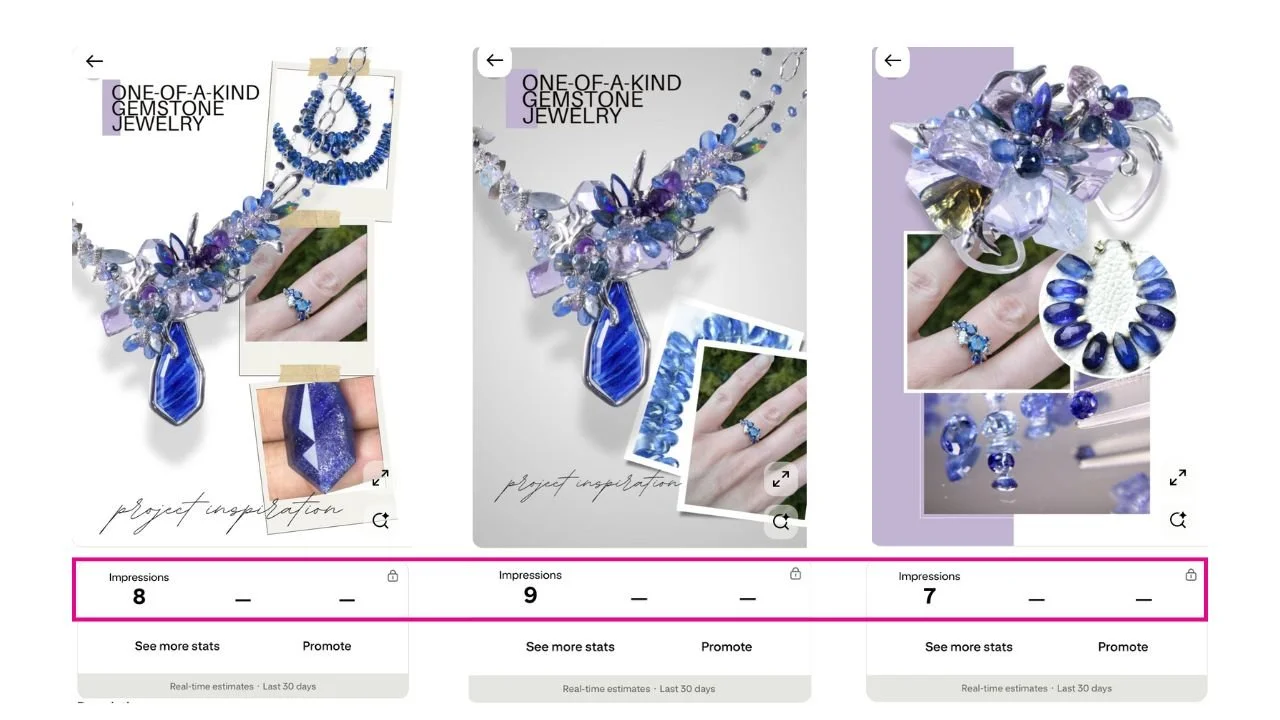
As a mini case study, I recently ran an experiment to test these Tailwind study findings for my own jewelry brand. I designed Pins in Canva for two completed commission pieces for a client, and wanted the Pin to tell a story about my process. I included images of her engagement ring, the gemstones I sourced for the project, and the completed necklace and bracelet. As you will see below, the engagement numbers were dismal.
Combined Impressions = 24
Combined Pin clicks = 0
Combined Saves =0
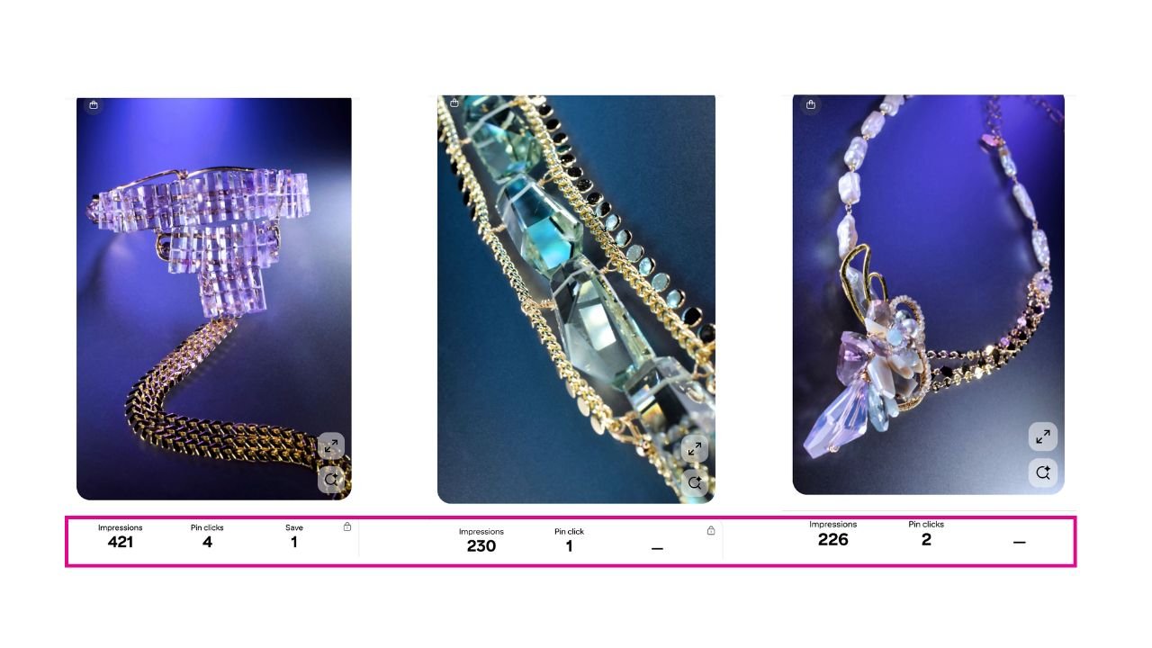
As a counterpoint to my control set, I created a variation set to test the findings of the Tailwind study, which found that ‘raw’ images perform better. This claim was supported by data on the most viral Pins in the fashion niche, which consisted solely of raw images.
I had just launched a new collection and decided to test with images from my new line. I didn’t implement any design elements, such as text overlay, just the raw image. As you can see below, the results are already outpacing the designed Pins from above by a large margin.
Combined Impressions = 877
Combined Pin Clicks = 7
Combined Saves = 1
So what have we learned so far? Designed Pins, text overlay, these have always been touted as best practices, but the Tailwind study findings say otherwise. This can be further supported by examining the top Pins on the platform for jewelry (or other creative product) related keywords.
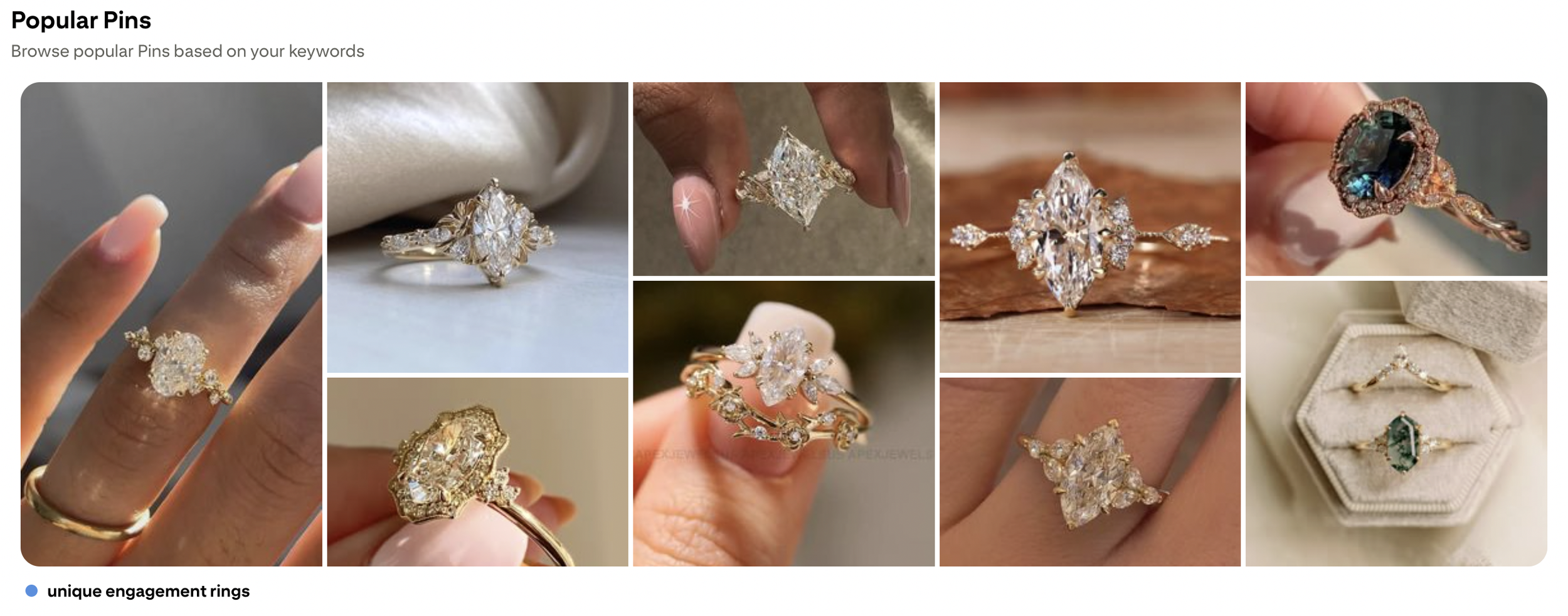
Go to Pinterest Trends
Scroll to ‘The Discover Trends in the United States’
Input a keyword you want to investigate, such as ‘engagement rings’
Click on the desired keyword in the left-hand results column
Scroll down the detail page to ‘Popular Pins’
This is a typical result of popular Pins. This came from researching ‘unique engagement rings’. As you can see, most of these appear to be candid shots taken with a phone or images that feature only the product.
To summarize, Tailwind analyzed viral Pin performance across 20 categories, and these are the findings:
There was a nearly even split between viral Pins that used raw images (no text, no design elements) and those that were fully designed (with overlays, templates, or typography).
But the magic is in the category-level nuance.
Fashion, beauty, and home décor leaned heavily on raw imagery because often, the product speaks for itself.
DIY, craft, and education spaces performed best when context was added, like how-to overlays or value-packed layouts.
👉 Takeaway for Makers: If your work visually explains itself (think: earrings on a model or a styled flat lay of your handmade candles), a clean, raw image can stop the scroll. However, if your content requires a bit more context, such as a blog post explaining how to use, gift, or wear it, a designed Pin with text overlay might serve you better.
To bring this back to a product seller, such as jewelry, I want to mention another thing I’ve encountered when reviewing my client’s top-performing Pins. This is a notification within the analytics section of their Pinterest Business account. It’s basically telling you that the product group, another word for product Pins, is turning into your top-performing Pin category.
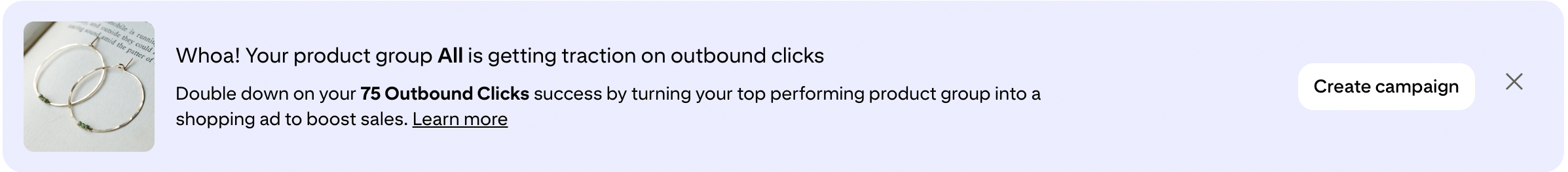
The total number of outbound clicks for this client for the month was 96. If 75 of those were from her product Pins, then most outbound clicks were a result of these. By the way, these product Pins are automatically generated once you upload your product catalog to Pinterest.
My guess as to why this is the case is that these product Pins are surfaced in all shopping and product recommendation feeds. They simply have a wider distribution compared to any published Pins, and shopping searches indicate a higher buying intent, which is why they receive the most outbound clicks. This supports two pillars of Pinterest’s market positioning:
To make Pinterest a shopping destination with a streamlined user experience from inspiration to checkout.
To create an environment for the best possible outcome for advertisers on their platform, with features like catalog ad campaigns. The more ads they sell, the happier investors are, even if it means a diminished user experience due to increased ad density.
Is Photography Not Your Thing? Here’s Why That Might Not Matter
Let’s address the hyperbole of this section’s header. Clearly, you still need great photos for your website. Stunning product photography is an absolute must. Please don’t skimp on this! However, when it comes to testing content strategies for Pinterest specifically, you may want to explore more spontaneous options.
This was one of the most surprising findings in the Tailwind study:
More than 25% of viral raw-image Pins used amateur-quality photos.
That’s right. Slightly off lighting, not-quite-right angles, and non-perfect backgrounds still saw massive engagement. Especially in authentic, lifestyle-heavy categories like:
Personal style / fashion
Home and decor inspiration
Natural skincare and beauty
So if you’re a one-person shop using your iPhone? You’re already playing in the same arena.
What does seem to matter is the intent behind the image:
Is it visually cohesive?
Does it evoke a vibe, a story, or an aspirational theme?
Is it relevant to what your customer is searching for in that moment?
Remember, pinners are usually browsing for inspiration. Pins featuring products unfettered by text or other design distractions may be more appealing for those collecting ideas.
Designed Pins Still Matter, Here’s When to Use Them
Not every image tells the full story on its own. That’s where designed Pins can really shine. This is why bloggers have heavily favored these types of Pins. A Pin pointing to a blog post with just an image would lack the necessary information to earn a click. Such as the topic and easy or impactful ways it can benefit the reader. Remember, these types of Pins were heavily favored by the above categories, needing more contextual information.
Designed Pins are ideal when you need to:
Communicate multiple features or steps
Promote roundups or collections (“5 Handmade Gifts for Her”)
Add urgency with text overlays like “Last Chance” or “Best Seller Alert”
Pro Tip: Use design elements strategically. Text overlays should not overcomplicate your overall Pin design. Don’t use too many different fonts either. Keep it to 2 or 3 at the most.
Strategic Implementation for Product-Based Brands
Ultimately, these findings are good news for small creative business owners, who are typically solopreneurs wearing many hats. They should make your approach to your Pins and Pin images more approachable. Now you have permission to give the perfectionist side of you a break…at least when it comes to your Pinterest marketing.
Ready to apply these findings? Here’s your Pinterest Pin Design Roadmap to test what works:
| Task | Why It Matters | How to Execute |
|---|---|---|
| A/B Test Designs | See what format your audience prefers | Pin the same product as a raw photo and as a designed Pin |
| Mix Visual Styles | Different users respond to different cues | Try clean minimalist shots AND trend-forward design overlays |
| Track What Resonates | Data tells the real story | Review Pin analytics monthly to double down on what performs |
| Mix Spontaneous & Professional Style Photography | Your audience may prefer more candid shots | Try both styles of photography to see what resonates best |
The Mindset Shift: You Don’t Have to Be a Designer, You Just Have to Experiment
If you’re still having difficulty letting go of your perfectionist side, I understand. But remember, you’re not designing for you or even for the most precious representation of your brand. You’re designing for users on Pinterest. You can either choose to ignore the data backed by analyzing millions of Pins or embrace it. Whether you agree or disagree, it leads me to my next point.
At the end of the day, what was the most liberating part of the Tailwind study?
There’s no one right way to Pin.
Instead of chasing a perfect aesthetic, you can show up consistently, test different approaches, and let your audience guide your next move.
Pinterest is a search engine with a visual heart. That means:
People are looking for answers and ideas
You can show up with authenticity, not just artistry
Raw or refined, both can work if the intent is clear
Conclusion: Use the Data to Fuel Your Creative Confidence
Hopefully, most of you are inspired to do more and stay more consistent, given the lower bar of entry it takes to be successful on Pinterest through your Pin imagery or Pin design. ‘Consistent’ is the operating word here. That’s the real secret sauce for long-term success. The bulk of your time should be spent not in agonizing over your Pin imagery or design, but in publishing, often over time.
Your Pinterest strategy doesn’t need to be pinned to perfection.
What it does need is:
Curiosity about what works
A flexible approach to content design
A system (like your seasonal content calendar) to keep you consistent
Whether you’re shooting with a DSLR or your phone, using templates or not, what matters most is showing up. The next viral Pin could very well be yours.