
The Pinterest Color Palette Trap
Why Your Brand Colors Might Be Sabotaging Your Pinterest Viral Potential
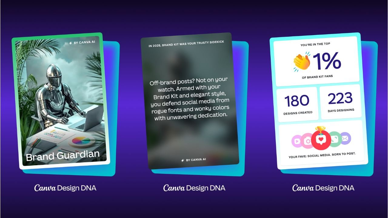
I have a confession to make: I love a good brand kit. There is something deeply satisfying about hex codes that match perfectly across a website, Instagram, and packaging. (Same here 💅).
I have proof when I went to discover my year in design on Canva. Apparently, I’m in the top 1% of brand kit fans, which makes sense given the number of client accounts I've managed.
But recently, I dove deep into a massive study by Tailwind analyzing 1.2 million Pins, and the data forced me to face a hard truth: Pinterest does not care about your brand colors. This can be tricky when brands have strict guidelines for how they consistently show up across all platforms.
I get it. Anyone who specializes in branding will tell you that brand recognition is extremely important, serving as the foundation for trust, loyalty, and sales by making a company memorable. As the preferred choice over competitors, consumers rely on familiarity to make quick decisions. [1]
This argument, while generally not wrong, tends to favor larger brands with strong brand recognition. Think Tiffany, Chopard, or Cartier, to name a few. But having this kind of brand sway is unlikely for a small independent jeweler or even a more established jewelry store on a bigger stage of the worldwide web, where reach extends beyond your loyal audience.

Pinterest is a smaller but similar stage where users are not familiar with your brand. Additionally, the psychology behind how people search on Pinterest is unique to the platform's nature. In fact, sticking rigidly to your aesthetic might be the very reason your Pins are getting scrolled past.
The "Pinner Mindset" vs. The Brand Ego
During the presentation of the data, Danny Maloney (CEO of Tailwind) dropped a psychological insight that changed how I view creative strategy:
“To a Pinner who doesn’t know our brand yet... seeing our brand colors in a Pin doesn’t really mean anything to them. Optimizing more for their frame of mind in that moment... probably makes more sense.”
This is the crux of the issue. When someone searches for "Fall Wedding Jewelry," they have a color palette in their head—burnt orange, gold, warm neutrals. If your brand colors are Hot Pink and Neon Green, and you force those onto a fall-themed Pin, you create cognitive dissonance. You break the user's immersion.
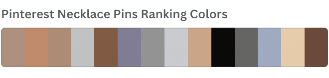
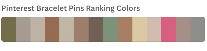
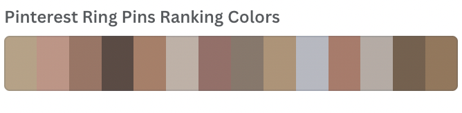
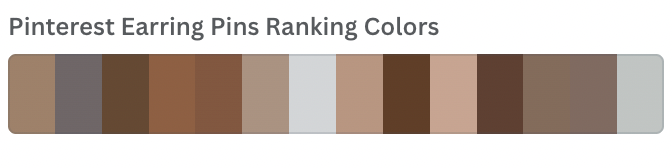
I’ve also gone so far as to analyze the predominant HEX color codes in the top-ranking Pins for the jewelry category, and as you can see below, they consist of an entirely neutral palette. This means that users are most frequently engaging with jewelry Pins in these colors.
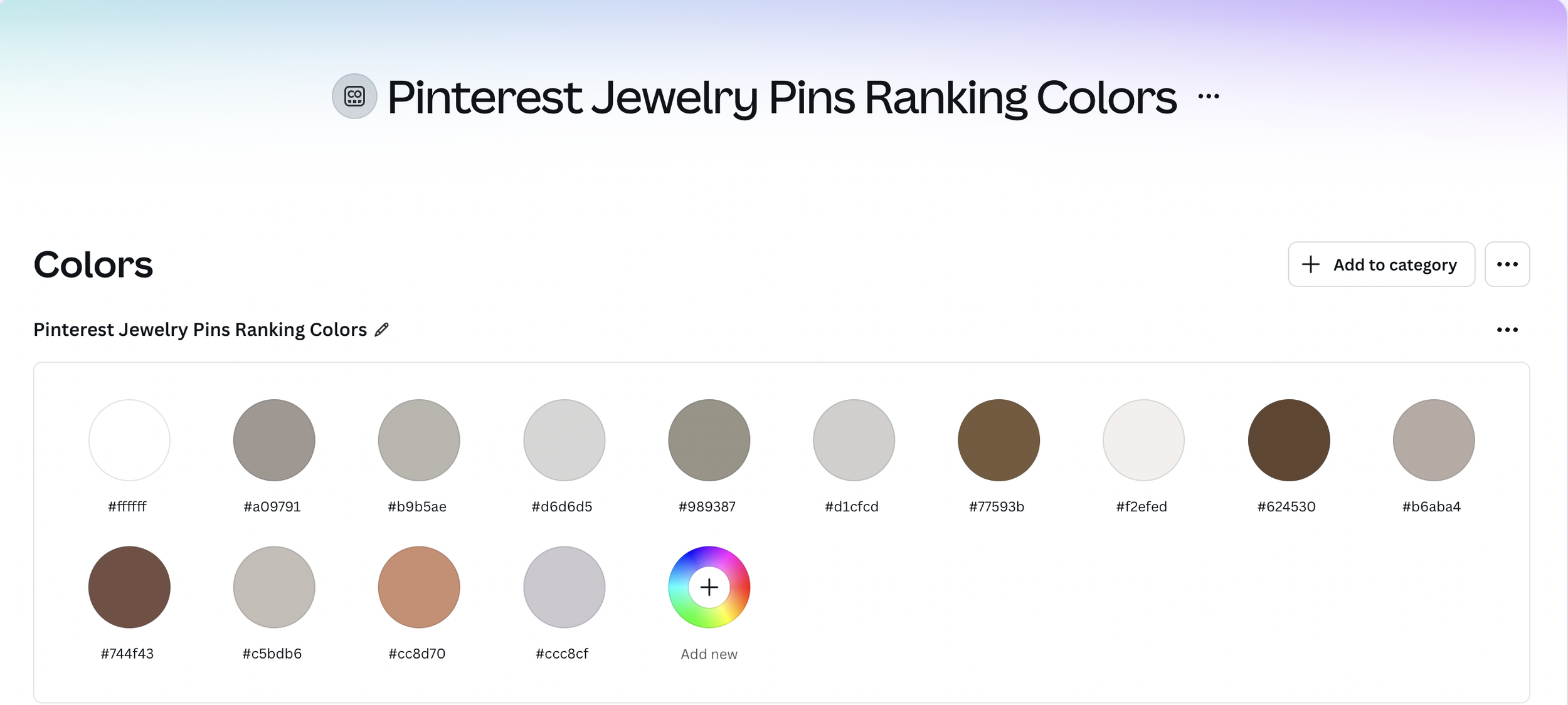
And, yes, I made a Canva Brand Kit for the primary colors in top-ranking Pins for all of the following categories in addition to ‘Jewelry’:
‘Necklaces’
‘Bracelets’
‘Rings’
‘Earrings’
What the Data Says About "Winning" Colors
The study found that only 4% of viral Pins strictly utilized the creator's brand color palette. That’s pretty compelling evidence to support why your Pins might have difficulty ranking if you’re too married to your branding.
So, what actually works? Here are the case study results from analyzing 1.2 million Pins and comparing them to the most viral Pins.
The Neutral Dominance: 87 of the top 100 pins were heavy on white, near-white, and soft greys. Not terribly surprising based on my analysis above.
The "Aqua" Surprise: Teal, aqua, and beige appeared significantly more often than expected in high-performing Pins. If aqua is one of your brand colors, consider yourself lucky.
High Contrast: Simple black text on white backgrounds (or vice versa) outperformed complex color combinations. This is notable because it underlies some best practices for graphic design.
How to Apply This Without Losing Your Brand Identity
You don't have to delete your brand kit. You just have to adapt it. As a Strategic Content Architect, here is how I advise my creative clients to pivot:
Match the Season, Not the Logo: If you are pinning for the holidays, use holiday colors. If it's summer, lean into the brightness.
Pull Colors from the Product: Use a tool like Canva’s Color Palette Generator to pull the exact tones from your jewelry or product photography. Use those as your background or accent colors.
The "Scroll-Stopper" Rule: Use high contrast for your text overlays. Readability always beats branding.
The Red Pin Geek Verdict
Sometimes the most "on-brand" thing you can do is break your own rules to serve your customer. If you want to stop the scroll, you have to look like the inspiration they are searching for, not an ad they are trying to ignore.